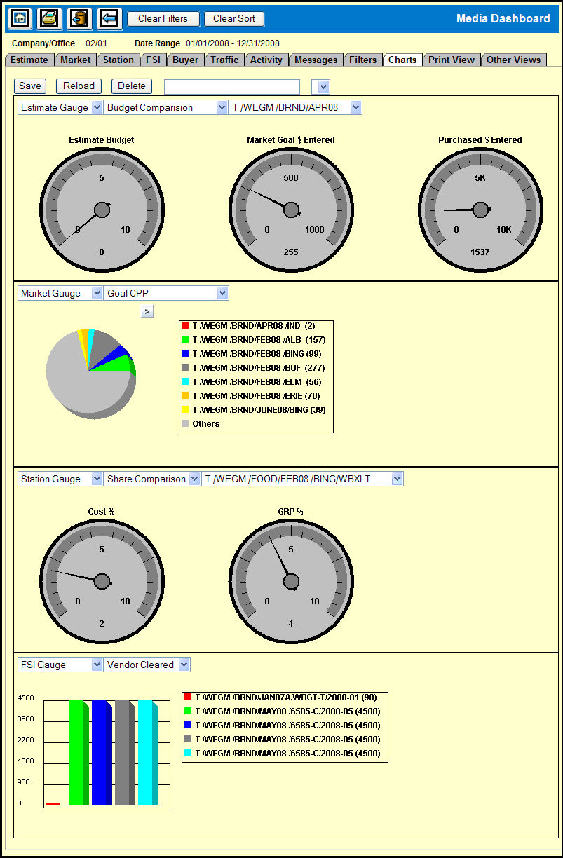
Along with the statistical display of each gauge, the Charts tab allows you to view a graphical representation of the statistical data. This gives you a visual display of the statistical information for comparison.
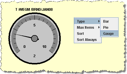
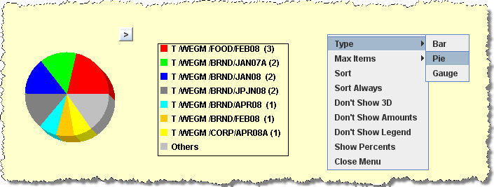
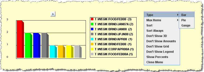
The Charts feature is very versatile in that it provides you with a multitude of options for creating various graphical representations of your data. For example, you can choose the gauge you wish to chart, the statistic you wish to chart, as well as select between a gauge chart, a bar chart, or a pie chart. In addition there are options that you can use to select criteria for comparison between gauges.
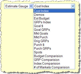
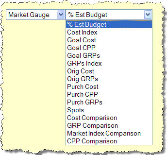
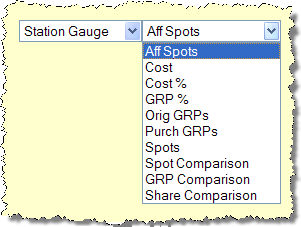
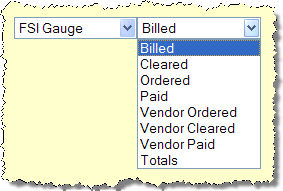
The Charts tab is divided into four sections and by default each section displays one of the four main gauges.
Each of the sections contains two drop down menus: One that allows you to choose a gauge and one that allows you to choose the pertinent statistics.
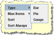
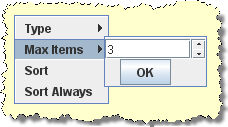
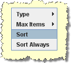
There are three chart types that you can choose from and a number of options that you can use to configure the chart and they are accessible via a pop-up menu.
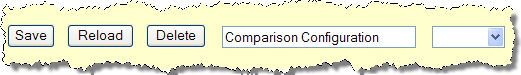
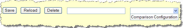
Once you create a chart configuration you can save and reuse that configuration.